Image Outlines
Images do not know what is behind them. A pale sky on a white card has no edge at all, and a photo with a bright corner blends into the page.
An inset outline fixes that with one line, drawn just inside the image at around 10% opacity.
The outline's visibility can vary based on light or dark mode and the image content.
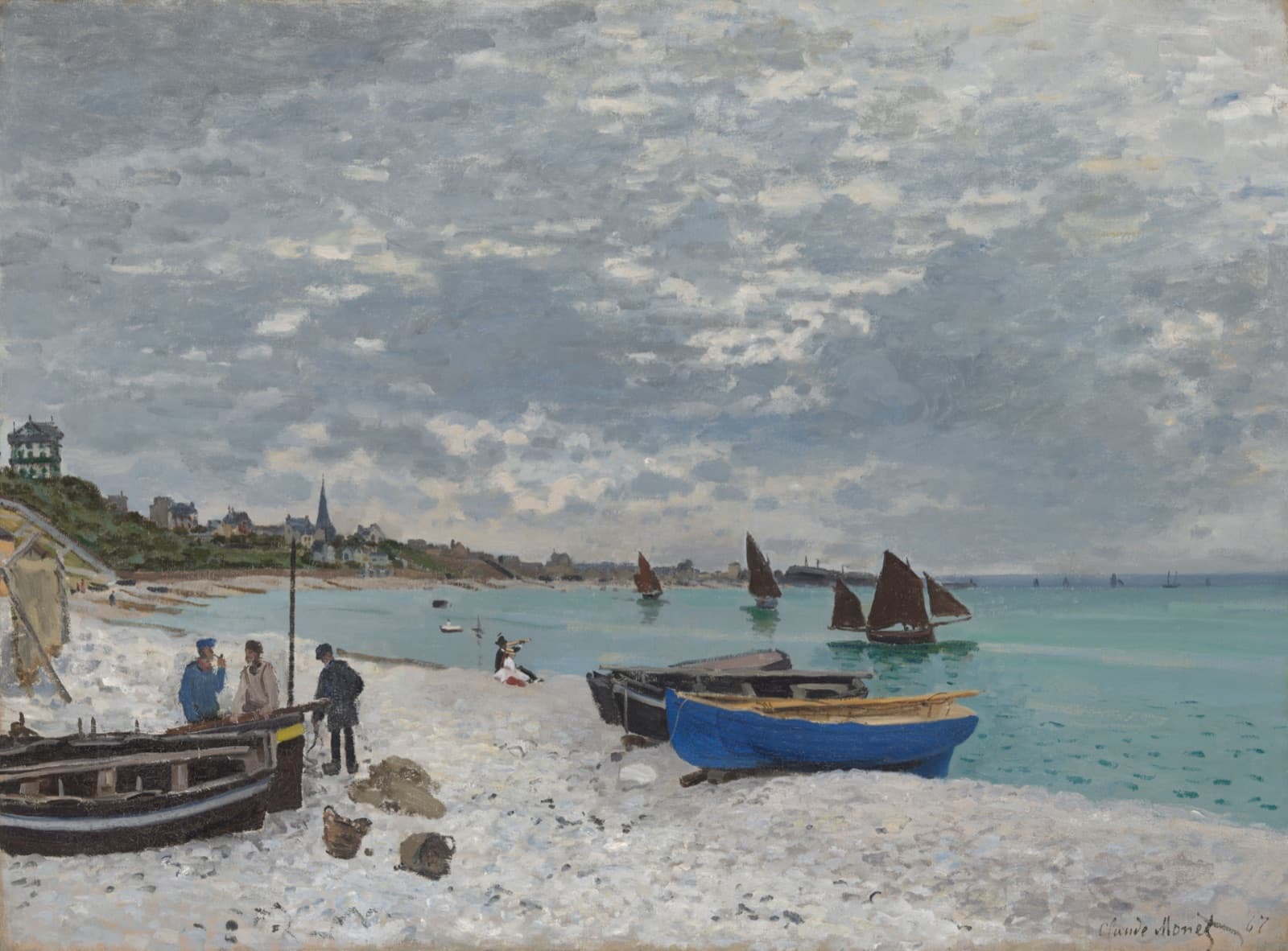
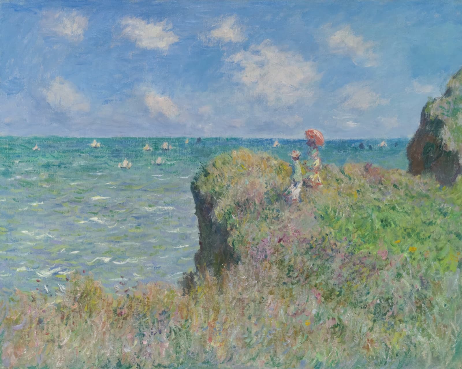

The line is too faint to read as a border. What you notice instead is that every image suddenly has a shape.
I basically learned this trick from Jakub. It is one of those details you cannot unsee once someone points it out.
Why not a border
A border sits between the padding and the margin, so it takes up space.
Adding one pushes content around and changes the size of the box.
Paint the line over the image, not around it. An outline with a
negative outline-offset, or an inset box-shadow, sits on top of the
outermost pixels.
How strong
Ten percent is a good default, but I like to tune it differently for light and dark mode sometimes.
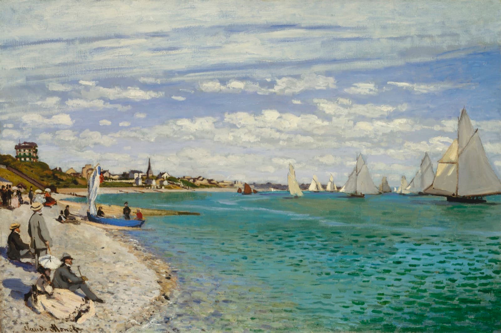
Below about 5% the line disappears against the pale sky. Above about 20% it starts to look like a frame, and the eye reads it as a design element instead of a fix. Stay in between.
Avatars
Avatars are where this matters most. They are small, round, and often mostly white: an initial on a light background, a pale logo, a photo of someone against a wall. Without an edge they float on the surface.




Usage
Set the outline color per theme. Black at 10% on light, white at 10% on dark.



<img
  class="rounded-lg outline-1 -outline-offset-1 outline-black/10 dark:outline-white/10"
  src="/cover.jpg"
  alt="Album cover"
/>
img {
border-radius: 8px;
outline: 1px solid rgb(0 0 0 / 0.1);
outline-offset: -1px;
}
.dark img {
outline-color: rgb(255 255 255 / 0.1);
}Keep it off images that already have a hard edge, like icons drawn on a transparent background. The outline only helps when the image fills its box.
Resources
Details that make interfaces feel better - Jakub Krehel's list of small touches, including the inset image outline this page is about.
outline-offset - The property that pulls an outline inside the box instead of around it.